Tabber
Browsing Made Easy

OVERVIEW
Problem
Knowledge workers don't have a simple way to organize and store online content, such as tabs, images, links, articles and online research. Even if they implement an ordered method of documenting and storing their information, they have difficulty recalling where and what they stored, completely negating the purpose of having a documentation system in the first place.

Solution
Tabber, aka Pinterest for Work, allows knowledge workers to access, store, and organize all of their content onto one user-friendly platform, saving users their time and their sanity. Leveraging our backgrounds in human-centered disciplines (eg. user experience design, branding, strategy, and advertising), we were able to pitch to investors after a 14 week period of identifying product-market fit and potential clients for the product.
[This project was based on a transdisciplinary class hosted by the Product Design department at ArtCenter College of Design]
My Role
Co-Founder
UX Designer
Researcher
Timeline
Jan. 2018 - April 2018
Team Members
Tools
Sketch, Invision, Illustrator, Photoshop


Our Approach
We spent a hefty amount of time trying to find product-market fit. As we began to form a better understanding on the problem our users were facing through research and testing, we had pivoted significantly from our original idea. It was critical to adopt a design sprint framework by rapidly producing rough prototypes and conducting interviews in a week-by-week fashion to quickly validate with users.
01
Research
Competitive Landscape
Secondary Research
Expert Interviews
User Interviews
Cold Research
Market Research
Personas
02
Design
Informed Brainstorming
Alignment/Problem Prioritization
Information Architecture
Wireframes
Interactive Prototype
Lo-Fi + Hi-fi Designs
03
Evaluate
Usability Testing
Design Iterations
Pivoting
Pitch to Investors
My Contribution
I primarily focused my efforts on organizing, conducting, and synthesizing interviews with experts to create a better understanding of our target market. The insights from our interviews and market research allowed me to quickly persuade my teammate that we pivot twice during this project in order to help us find product-market as efficiently as possible. Another large portion of my efforts was spent on creating wireframes and interactive prototypes.
In terms of the business side, I took the lead on figuring out our business model and how our finances would have to shift in order to create a realistic roadmap to launch and grow a SaaS start up. I also created and conducted interviews with our board of advisors who gave us expert knowledge and support on their areas of expertise (ie. business, engineering, adtech, growth, finance, and marketing) which helped me to identify our market size.
I pitched to investors at M13 in combination with a pitch deck that my teammate, Sophie, helped create.
RESEARCH
We initially tried to figure out an alternative business model within the education space for students to learn and practice specific skill sets (ex: problem solving with design thinking methodology) that were not prioritized in public schools; however, through a series of primary and secondary research detailed below (including competitive analysis, market research on trends and stats, and user interviews), we realized that there was a bigger and more pressing opportunity: providing a digital documentation platform for both students and knowledge workers. That's when we had our first pivot!
User Interviews
We realized that as students, we don't have an easy and effective way of organizing all the content we are collecting for research, inspiration, and documentation. Coincidentally at the same time, we learned from expert interviews that they were experiencing similar pain points. We quickly began to shift our focus from purely a student perspective to identify what our total addressable market could hypothetically look like.
Interviews with experts and users verified one of our main hypotheses that this problem is relevant to not just students but also professionals that are labeled as knowledge workers.
If I could quickly and easily save a reference to any site, including those without images, I'd just use that for everything.
Alison Dalton
ArtCenter Administrator
Wish there was a better way to organize and store information. I do not have a good system.
Chris Hacker
CDO - Hacker Design Group
In marketing, we are always looking for ways to innovate. Having a searchable database would be such a huge value.
Jamie Robinson
Marketing Consultant
I can't always remember which method I used to store something for future research!
Dana Walker
ArtCenter Managing Director
Competitive Landscape
This portion of the research significantly impacted which features we decided to prioritize on later in the design process.
We first looked into the market, trying to find good references and gaps that still existed within the current market. Our goal was to find which needs were and weren't being met for our users. We focused on learnability vs ease of use (in terms of organizing content) as a way to compare our competitors' performance levels.

We analyzed the different weak points for the most popular software programs used by our users (for online information storing platforms).
Findings to Design + Business Decisions
Knowledge workers will continue increasing in the work force and fall under a wide spread of industries and professions
Business
Roadmap Strategy
conversion to retention
There's high chance students will continue using Tabber when they join the work force as knowledge workers have similar pain points as students.
Design
Feature Prioritization
Focus on prioritizing features for V1 on the needs of the students.
A significant number of knowledge workers have more than 10 tabs open at a time at least twice a week. During these instances, they cannot recall from memory which tabs exist in their internet browser.
Design
Behavioral Goals
Users have difficulty recalling which tabs they have when it exceeds +5 which means they need another method of staying organized and storing tabs.
Saving and documenting content is only the first hurdle. The 2nd biggest pain point is recalling back to what users saved.
Design
Feature Prioritization
Good organizational design, recall, and search features will be crucial for long term retention.
Business
Scaling + Revenue Strategy
As users grow, our database will scale as well, allowing us to create a library for users to find suggestions based on their interests and uploaded content. This will affect ad revenue as data increases.
Many users store links in documents like Google Drive. This is a horrible method as they can't recall what the links are for. Pinterest can't store text-based content. There are no good alternatives.
Design
Feature Prioritization
Figure out a way to store both images, videos, AND text-based content (including URLs). An auto-generated preview feature for URLs could help users quickly recall the purpose of certain links (similar to Facebook's auto-generating links to articles.
Personas
To better guide the later stage of our process, I consolidated all of our synthesized information from research and interviews to create the following two main user groups.
Needs
-
Needs a visual way of recalling past poster designs for movies based on themes
-
Wants a database to search for past movie promotional material
Frustrations
-
Internal database is impossible to use as nothing is searchable
-
Has to manually create visuals for each new project to present to the team and stakeholders


Isaac the Innovator
Marketing Director
50s


Carol the Curious
College Student
20s
-
Has a diverse array of interests and documents she needs to store (research papers, DIY inspirations, beauty tips) but doesn't have a single platform to consolidate
-
Prefers having content that she can access quickly and get an idea on what the content is in a summarized fashion
-
Feels stressed everytime she can't figure out where she placed a certain document on Google drive
Frustrations
Needs
DESIGN
From our research, we brainstormed solutions that we later ranked based on feasibility for Version 1 (V1). Our core priority was to quickly create wireframes that tackled the challenge of organizing such diverse content onto one platform that we could test with potential users. We realized from our research that it would be better to minimize the number of features we would build for V1 and instead focus on perfecting the user experience for the following core functionalities.


Wireframes
We quickly transferred some sketches into black and white wireframes on Illustrator. We then received feedback from potential users.


High-Fidelity Design - Iteration 1
For the first iteration, we wanted to validate whether the flow was simple enough for users to learn quickly. We were also focused on trying to figure out if the level of affordance we were giving to certain groupings made sense to the users. We used Sketch and InVision to create a basic interactive prototype as that was determined as just enough to test our assumptions and designs.

EVALUATION
User Feedback and Design Changes
Due to time restrictions, we were only able to do fairly quick usability testing sessions as we went through 3 iterations with potential users. We looked to see if the layout made sense to the user, which features and pages they would spend most of their time on and which features were unnecessary for V1 for product launch. Below are some highlights on the feedback we received.

Users had no trouble learning
how to post content
Most users seemed much more interested in how information was organized more-so than the flow in which they would have to input information. Because much of our design for posting text and image based content (blog/article style) was familiar to users, they didn't have too many issues figuring out how it worked.
Previews are king
When searching for content, users expect to have a quick glance at the page and decide if that specific post is the correct one. Users valued their time and having to click on a post to then be directed to a new window were too many steps. They preferred to see much more content on one screen and quickly be able to understand what content was about. With this feedback in mind, I realized that a hover mechanism would be more appropriate as that would allow users to skim quickly through various posts.
BEFORE
AFTER

More visible posts on one window
Added hover capabilities to preview posts and content quicker


BEFORE

EXPLORATIONS
AFTER


Drop down menu to access boards
Can see more boards at the same time
Hard to recall what content was actually put into boards especially if there are many
01
Pros
Cons
Visual library
Highlights the main content on each board
User will have to spend more time to customize what they want to highlight
02
Pros
Cons

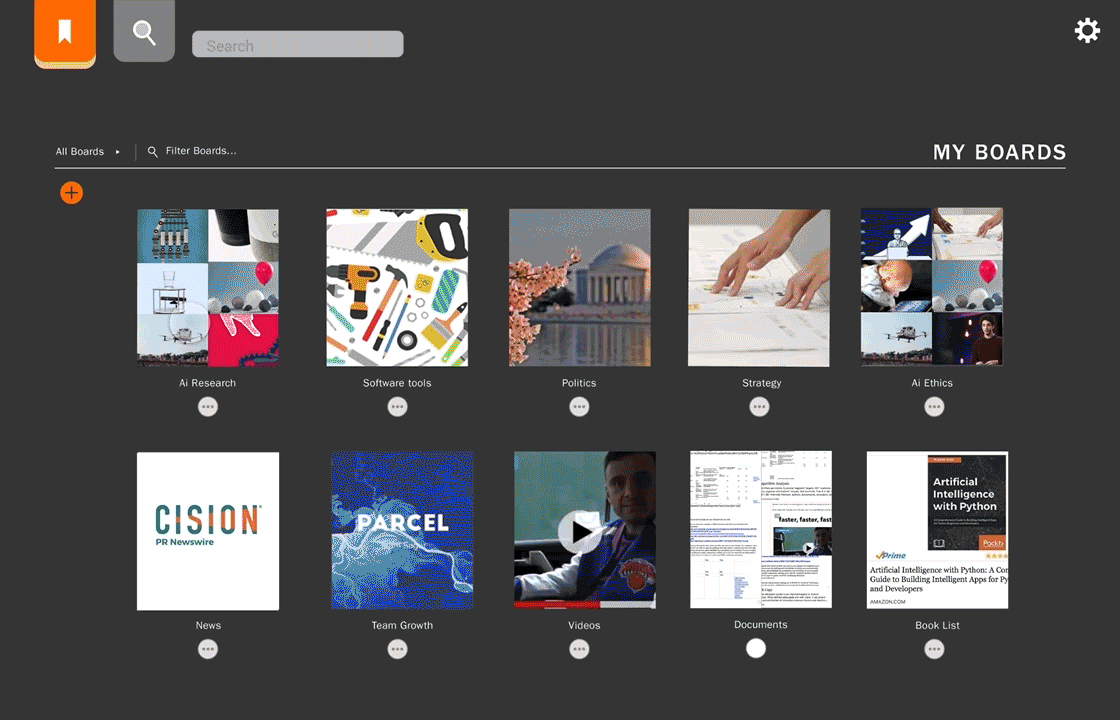
Visual library of playlists as the home screen
We realized we needed to have two main pages: search screen and library playlist. The library playlist would have a combination of content generated by users themselves and that of ones users created from the searches. In our exploration we tried to understand what would be the easiest way for users to go back to past playlists. From user input, we realized visuals were key which led us to focus on Concept 2.
Lessons Learned
This project was my gate into the world of product and business development and how much one depended on the other and vice versa. I never knew how complicated this relationship was until I ventured into the world of start ups where I had to become not just a UX designer but also a business designer. Below are some summarized learnings!

Celebrating after our first pitches! Woo!!!
Pivoting at the right time is life or death to start ups.
When I look back, the naive and hopeful expectations I had for my "company" were...naive. To create a company that is needed by the user, that can compete and be advantageously different from competitors in the market, and finding the right way to pitch the start up were all factors that I hadn't been exposed to in much frequency and in detail when solving design projects; however, with all said and done, I've also learned it's necessary to have a strong rational faith in your product and company in order for it to survive and thrive.
Having the right team of experts will help you thrive.
Each time we pivoted, each time we had no idea how we would generate revenue, each time we began to doubt ourselves, we had an amazing group of advisors we could rely on for advice that we had painstakingly reached out to fortunately early on in our process. This helped fill in the gaps that were lacking in our knowledge and expertise, such as adtech, engineering, target markets, and revenue models.
Developing a business case for your start up sometimes will trump design details.
We realized how fast time ticks when building a start up from scratch! There are so many questions that need to be answered, so many decks that need to be redesigned, so many business components that need to be filled out. The more I learned about product development, the more I realized we had to prioritize and be extremely strategic on which features we would be pushing out for our MVP. Contrary to typical design prompts, we couldn't go for the "ideal" scenario. We had to be realistic and really think about what our investors and users would value most when it came to our first product version.
Pitch decks are completely different from design decks. Keep it simple, strong, concise.
Whoever said pitch decks were easy to make were lying. We spent so much time on rewording the pitch deck, changing the order of slides, slicing and adding in content, and gathering feedback from our peers and advisors. The hardest part (although ironically the part we as designers are most used to) was cutting and cutting and cutting. Creating a pitch deck taught me the importance of good copy writing and how even if I believe there's no more to cut, there always will be something else waiting to get the ax.